
Identity · 24 hours · this run locked Hot A
Kuro Neko Roasters
Dark Roast. Light Heart.
The brief
Specialty coffee. Dark roast, high caffeine, single origin. Night bags, not a cafe. The name is the cat.
What it had to live on
A lock for a bag, a die-cut sticker, and a little DTC site. No cafe. No shop. Cat as a stamp — not a cup with ears glued on.
Who it's for
Gen Z and millennial creatives, gamers, remote workers. Playful, edgy, still premium. They will not buy another beige bag.
What the brief told the generator to feel
They expected a coffee brand that still looks like coffee — premium on a shelf — without joining the oat-milk beige pile. Playful, a little dangerous, still something you’d keep on the counter. No cafe. No shop. A bag, a sticker, a site you can run from the couch.
What the generator had to refuse
The constraints
The name is the cat. Coffee generators default to a cup with ears. Third-wave already spent a decade on beige, so premium cannot mean cream-on-cream. If ROASTERS becomes the hero, the run built a roasting plant, not a night bag.
One coffee brief, three nights. Loud A: KURO over NEKO, cat as stamp, pink Dark Roast / mint Light Heart — their line, mixed, not parked. Loud B overshot into extra slogans and made ROASTERS the hero. Middle went sweet pastels. Loud A locked because the night stayed a little dangerous and the cat stayed a tool.
Three generations
Same business. Three generations. You do not tap a logo on white. You tap a night the generator already dressed.
This generation locked
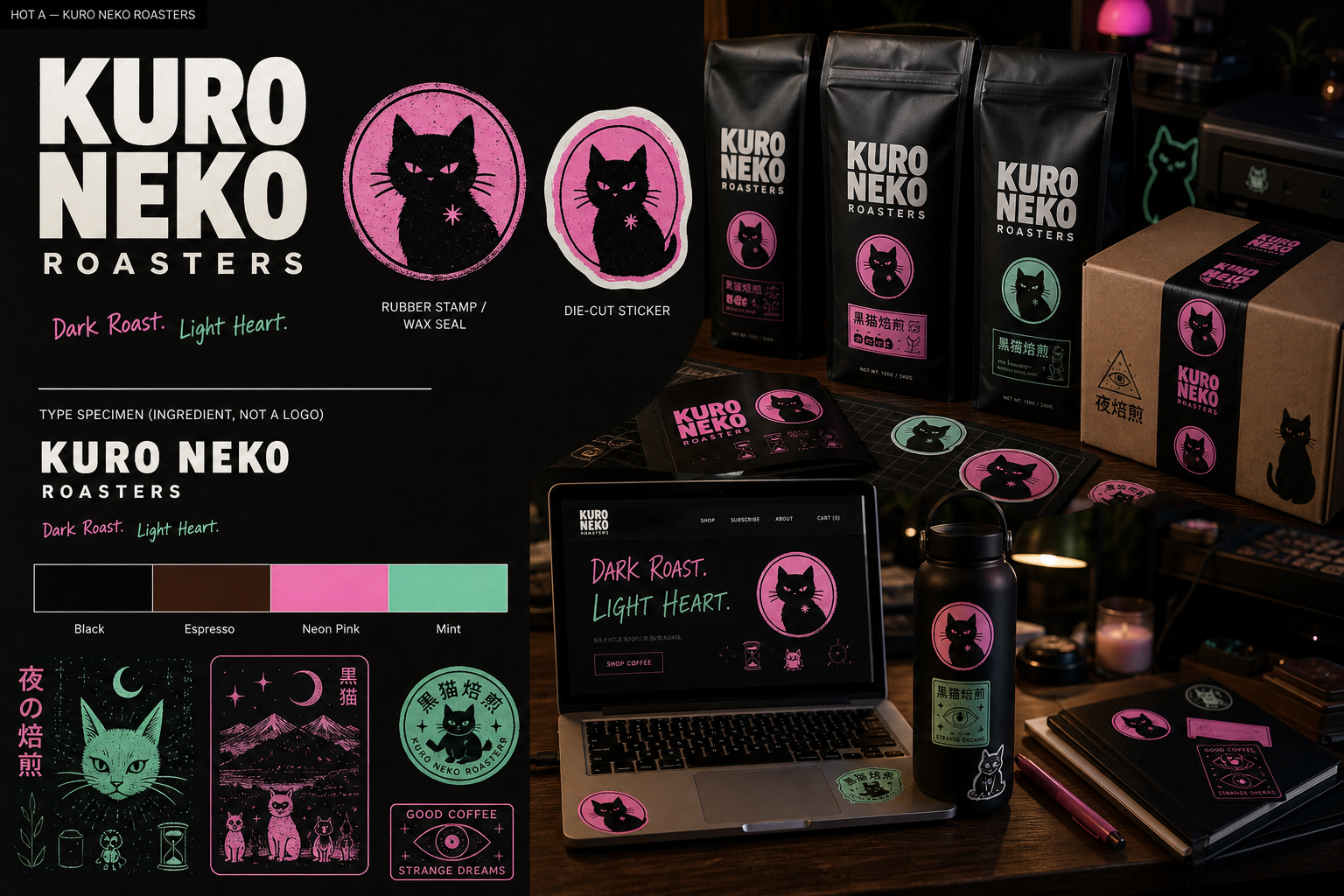
Hot A — the loud night
KURO over NEKO because the name is the picture. ROASTERS stays small and wide because it is a caption. Pink and mint mixed because Dark Roast / Light Heart were in the brief — color is the tagline. The cat is a stamp you could slap on kraft, not ears on a cup. Desk at night, bags in reach. Their people did not want the night to get polite.
Louder generation
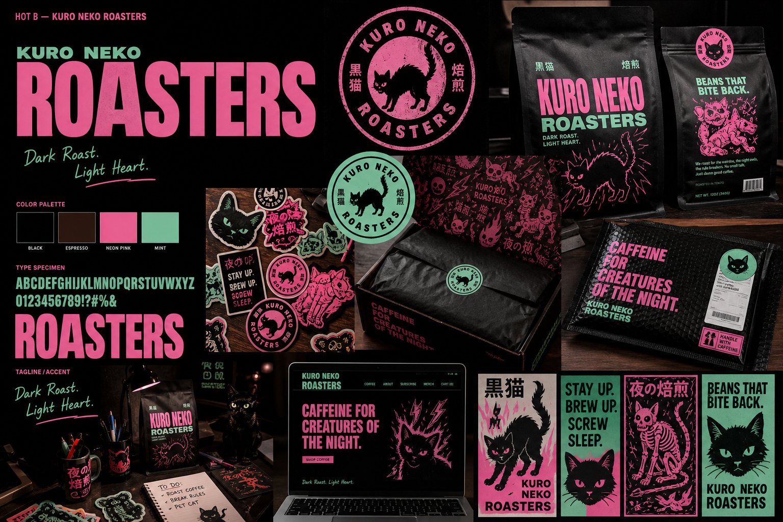
Hot B — a poster, not the brand
ROASTERS takes the stage. Extra slogans, extra creatures. The generator invented lines they never brought. Fun as a wall. Wrong as a lock. Extreme overshooting is the system working. You do not export that file.
Softer generation
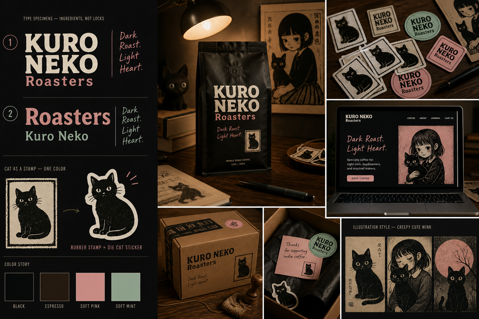
Medium — sweet. Too sweet.
Same cat, quieter pastels, a cozy wink. The generator followed playful premium without the danger. Perfectly nice. Their people buy dark roast at midnight. Nice is how you disappear next to every other bag.
Why this generation locked
The name is the cat. So the cat generated as a stamp.
The run did not draw a cup with ears. The stamp can live alone on a die-cut. The wordmark never swallows it. Black field, cream letters — because beige already had its decade. Pink is Dark Roast. Mint is Light Heart. Those two words were in the brief. If you rearrange that stack you are not looking at Kuro Neko anymore.
The export
Same file. Every surface.
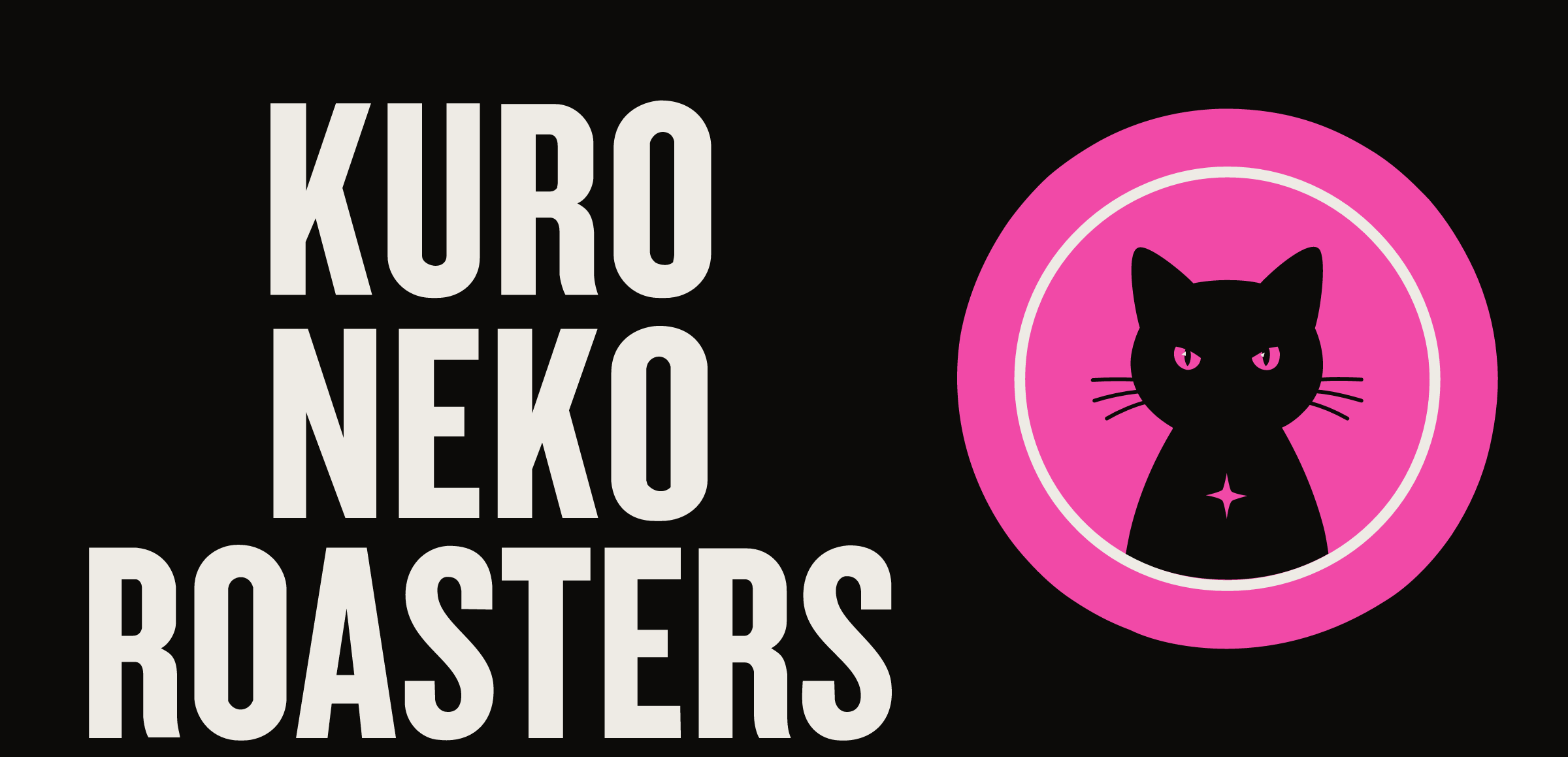
Lockup
KURO over NEKO. Always.
This is the name as a picture. ROASTERS is a caption, not the brand. Make it bigger and you are selling a roasting plant, not a night bag. The file is outlined. Same geometry on the bag, the box, the site.
Click the picture — full size
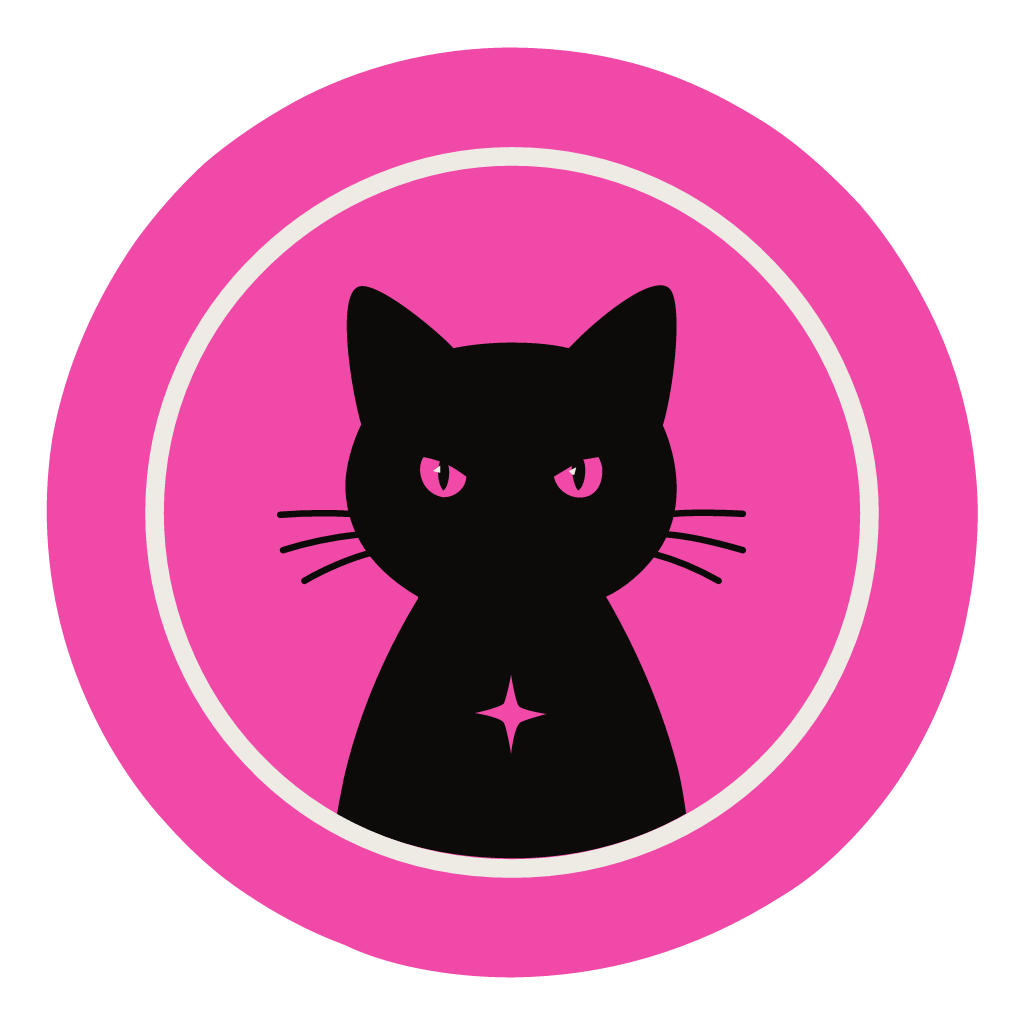
Stamp
The cat has to work at sticker size.
If it only looks good sitting next to the wordmark, it is not a stamp. It has to hold a die-cut by itself. No ears on a cup. No extra animals.
Click the picture — full size
Generated onto the real stuff
The brief named the objects. The run put the lock there.
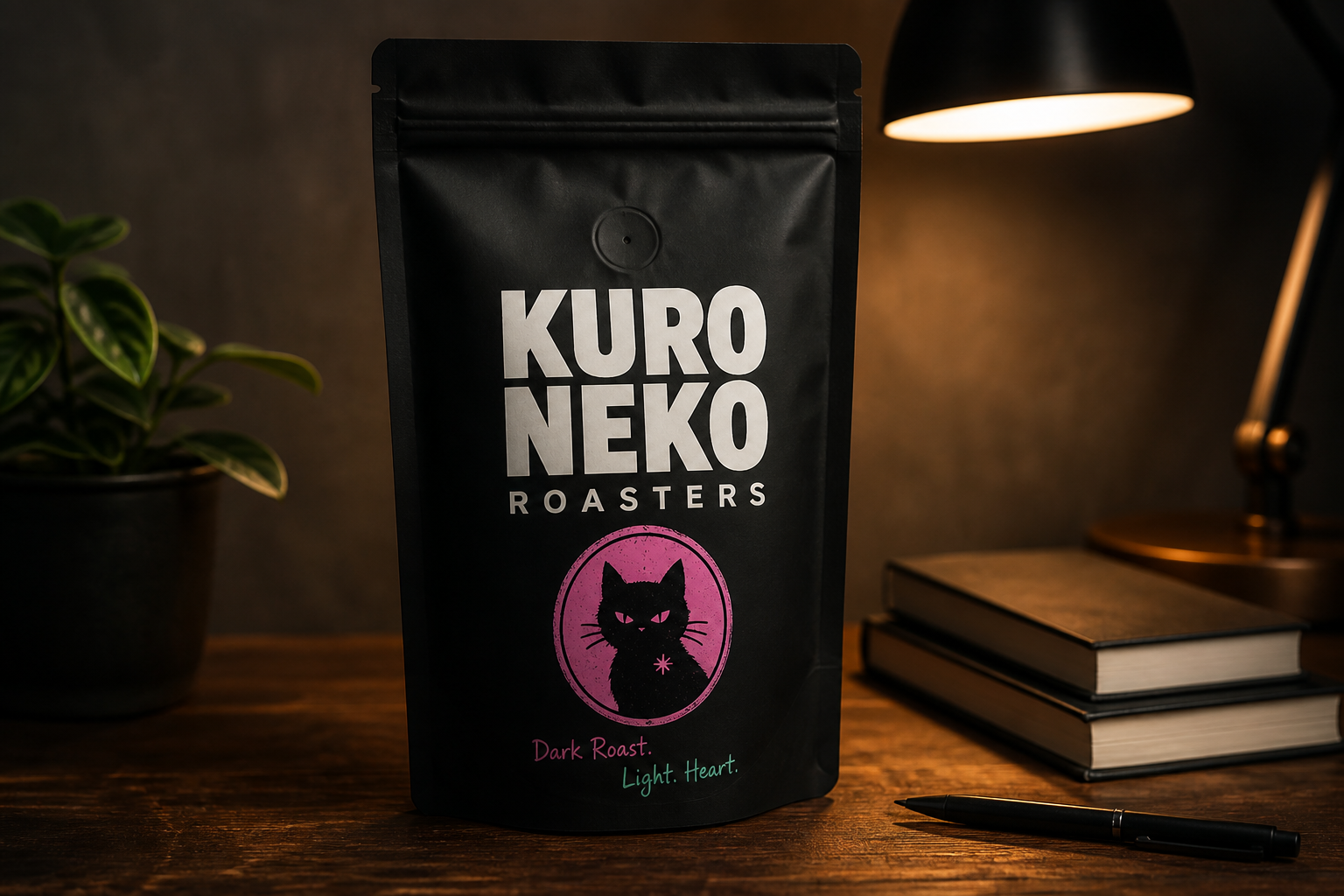
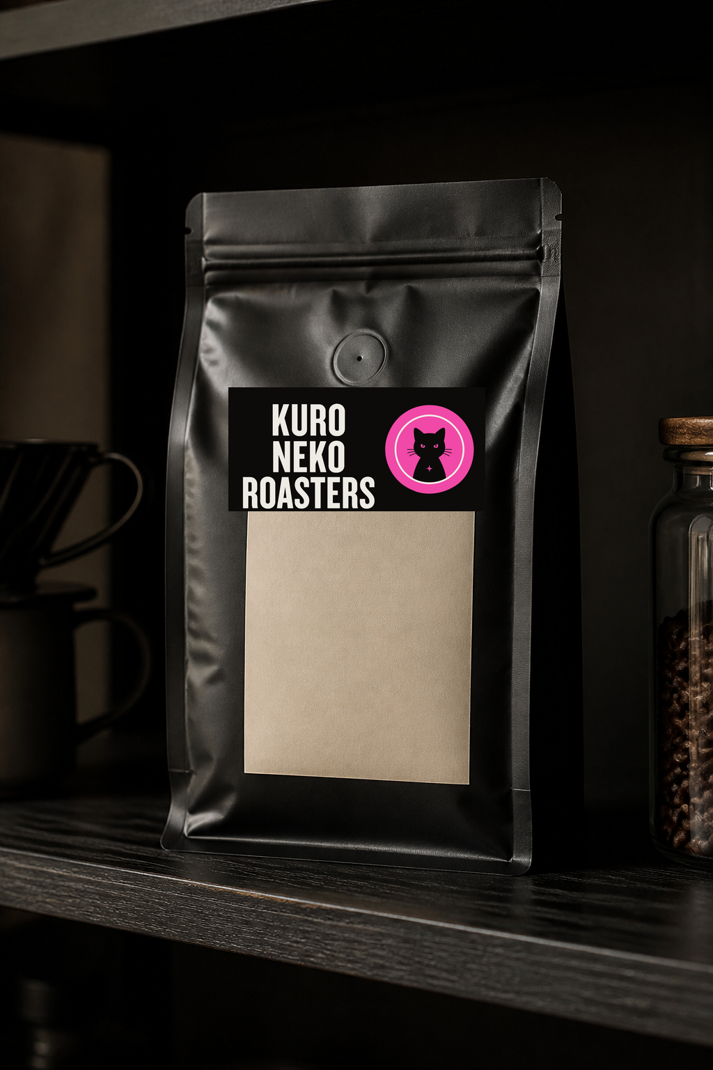
Coffee bag
This is the shelf test.
They sell bags, not lattes in a sunlit cafe. If this looks like a grocery tin or another oat-milk beige, the generation failed the people who actually buy it — night owls who still want it to look expensive. Black field. Cream type. Pink and mint as the two beats. The lock sits on the bag. The photo did not redraw it.
Click the picture — full size
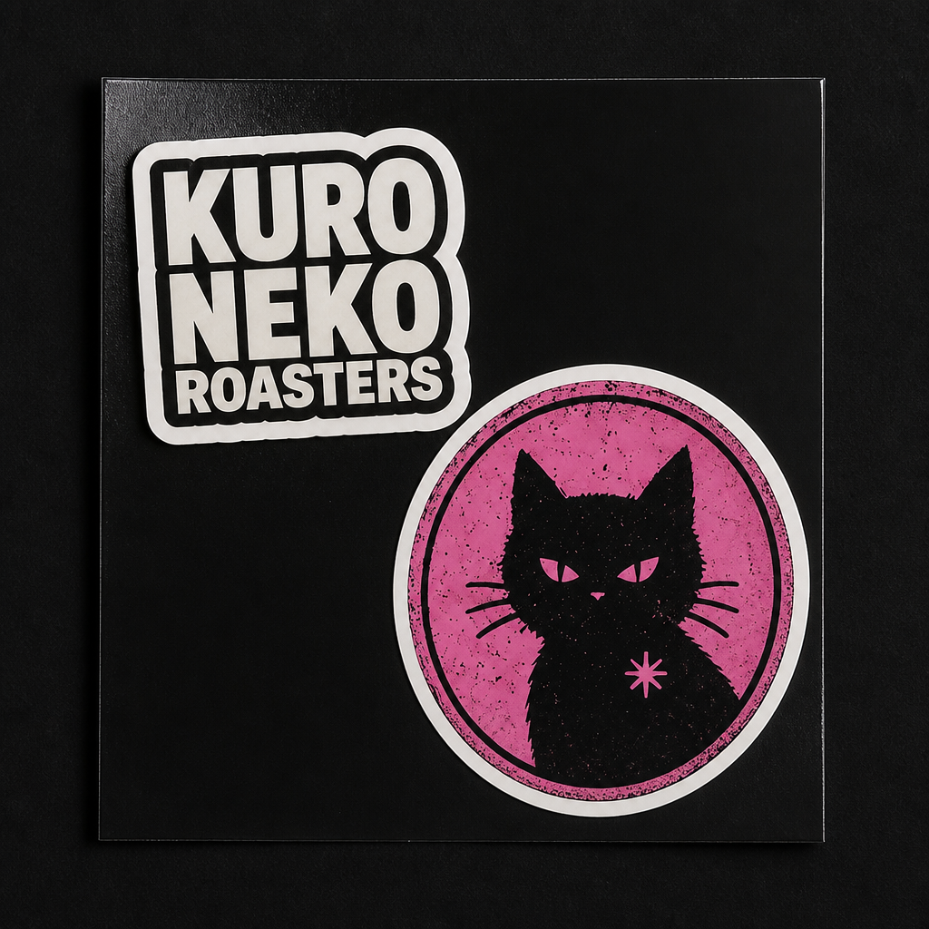
Die-cut
Proof the cat is a tool.
Stickers are how this brand leaves the bag. If the cat needs the wordmark to make sense, it is a mascot. A stamp you can slap on a laptop is the brief. This is that file, cut.
Click the picture — full size
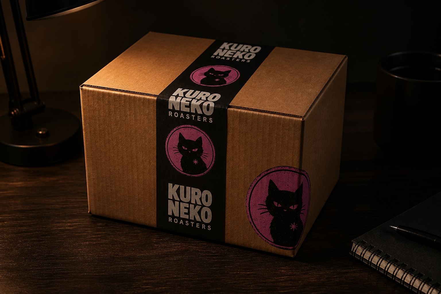
Shipper
The unboxing is part of the night.
DTC. No shop. The box is the handshake. Same stack, same stamp, no new slogan on the tape. If the shipper looks like a different brand, the site already lost.
Click the picture — full size
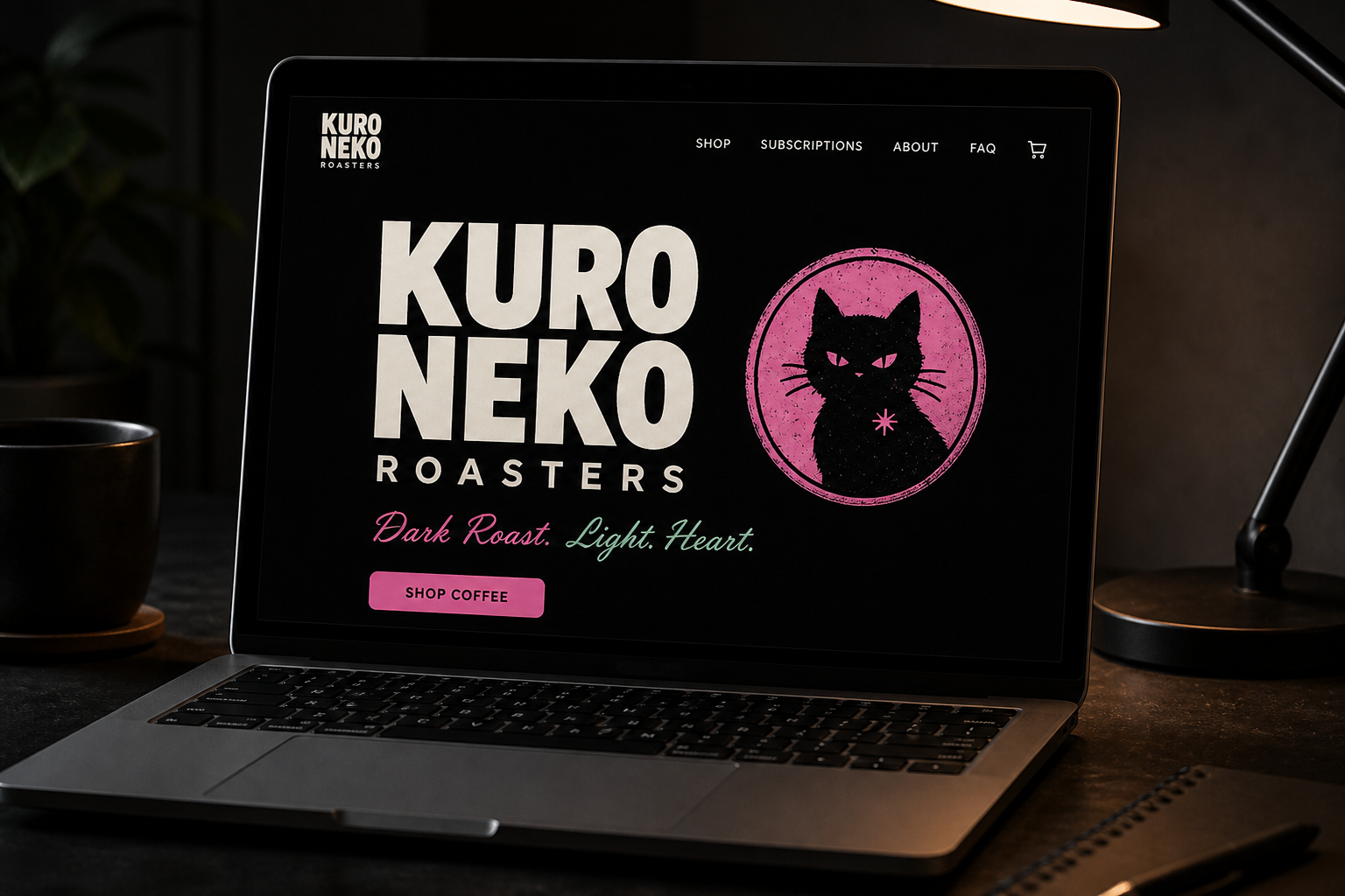
DTC site
A site you can run from the couch.
They did not ask for a cafe. They asked for a little storefront. Pink and mint stay as the tagline, not decoration. The lock is the header. The generator did not invent a URL or a cute extra line to fill the hero.
Click the picture — full size
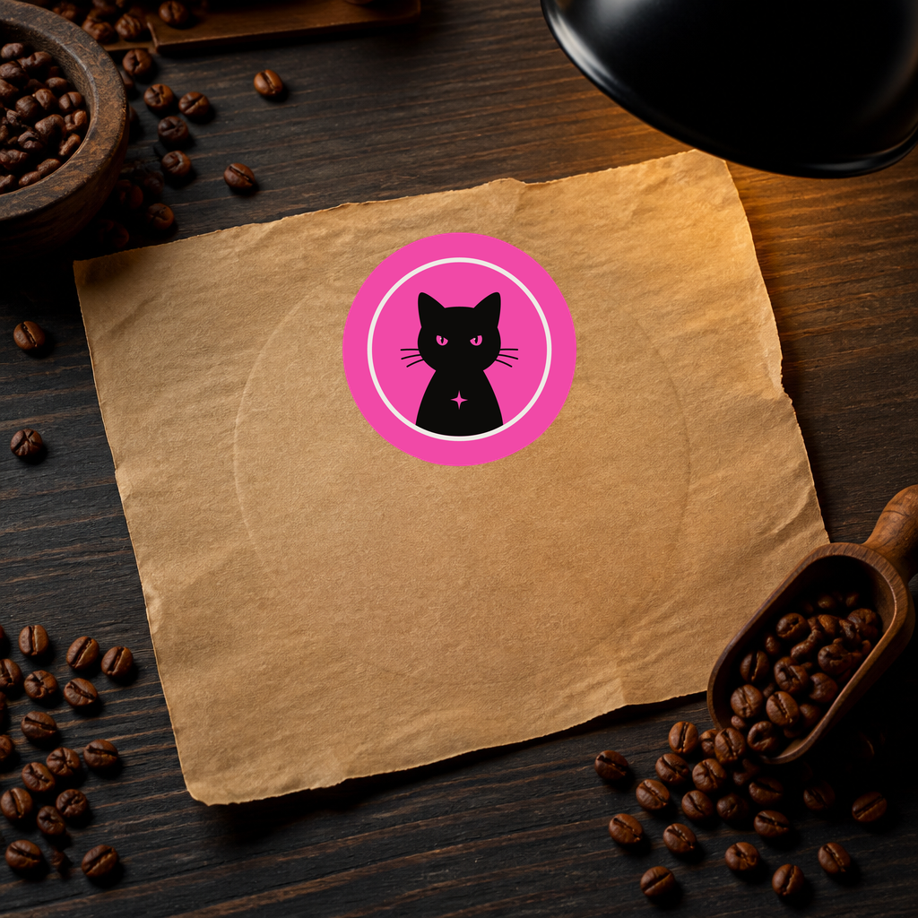
Close
Kraft is the honesty check.
Pretty on a black bag is easy. On brown paper you find out if the stamp has a spine. It does. That is why it is a stamp and not a gradient illustration.
Click the picture — full size
One color
If it dies in one ink, it was never a lock.
Print gets cheap. One color still has to say Kuro Neko. The stack and the cat survive that. Pink and mint are the voice, not the only way the mark exists.
Click the picture — full size
Anton for the stack — condensed, a little mean, still readable on a bag. The handwritten beats are the tagline they brought, not a second logo. Do not retype this in a free font and call the lock done.
Your turn
Three generations. You tap one. Still no call.